Dashboard
Driving a car requires you to see a control panel, that gives you instant information about your speed, mileage, how much gas you have left. You can consider having a software control panel in the same way: you need to know how every part of your processes is working and when you need to take actions.
Time-consuming, error-prone, manual data collection processes lead to inconsistencies and inaccuracies in consolidated data sets. Inaccurate data leads to errors in reporting and difficulty generating accurate insights.
CommonPaths delivers an automated data warehouse with purpose-built connectors to key performance indicators (KPIs) and metrics, helping the management easily consolidate multiple data sources into a single-source-of-truth dataset. With trusted and accurate data, organizations can ensure that all stakeholders are working with consistent, up-to-date information, leading to improved operational efficiency and strategic decision-making.
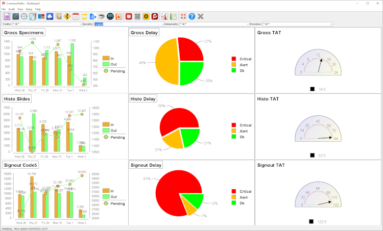
The 3 x 3 graphs show the volume flux, backlog and turnaround time in terms of volumes received, completed, pending and the average number of business hours to complete the tasks today and in the current week.
The items that are tracked depend on the processing steps:
- The number of specimens (not cases) in the grossing room
- The number of slides in the histology lab
- The time for the pathologists signout in Code5 minutes
Filters toolbar
The second toolbar on top of the screen below the main toolbar and above the charts allows you to filter the data and drill-down by facility, specialty, sub-specialty and procedure. The filters are cumulative, so you can select multiple filters at the same time.
Bars and lines charts
The 2 bars and 1 line chart to the left shows the daily breakdown of items received/in (amber bar), completed/out (green bar) and remaining/pending (green line with red circles) over the past week. The Y-axis to the left is for the bars (in/out), and the Y-axis to the right is for the lines (pending)
Pie charts
The pie charts in the milddle show the breakdown of cases status into 3 cutoffs: delayed (red), within range (green) and close (amber) to the alloted time. The alloted time for each specimen depends on its urgency and is different for biopsies (shortest) and radical resection specimens (longest)
dial chart
The dial charts to the right shows the turnaround time (TAT) of the current month in business hours. The times are cumulative, meaning the histoilogy time includes the grossing time, and the signout time includes both grossing and histology.